A self portrait in layers
I’ve unquestionably been heavily influenced by Saul Leiter of late, and more specifically his treatment of color and use of foregrounds/ reflections to create abstraction. Combine that with my normal cinematic approach to color and the somewhat more ‘controlled’ shooting mindset that working with the Otus forces results in a rather interesting set of images. Even if not all of them were shot with the Otus – I used the GR for the balance – the way I’m shooting remains the same. My ongoing studies of the abstraction of man take a step back: here, I think I needed stronger human subjects to make the compositions work. Enjoy! MT
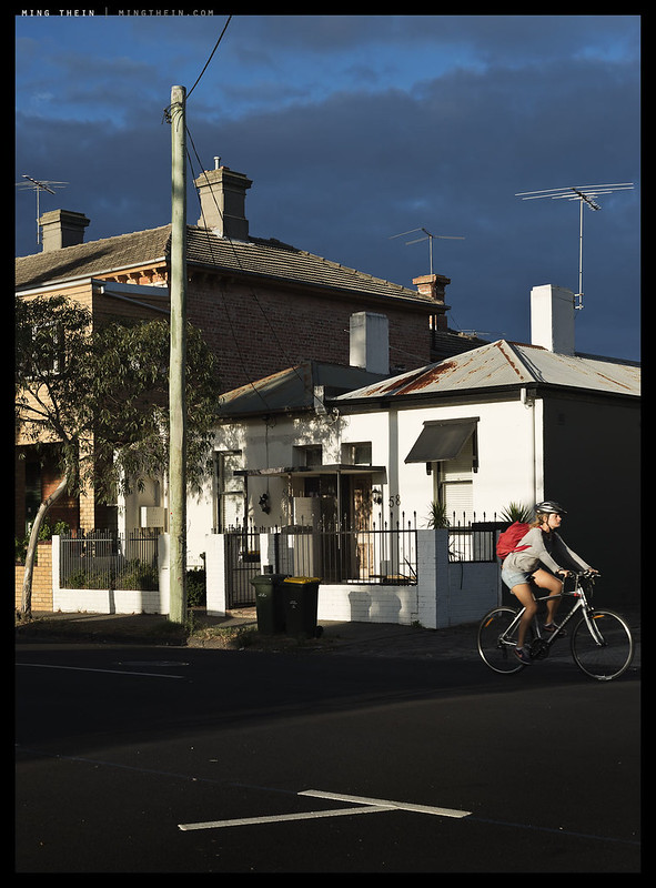
Evening cycle
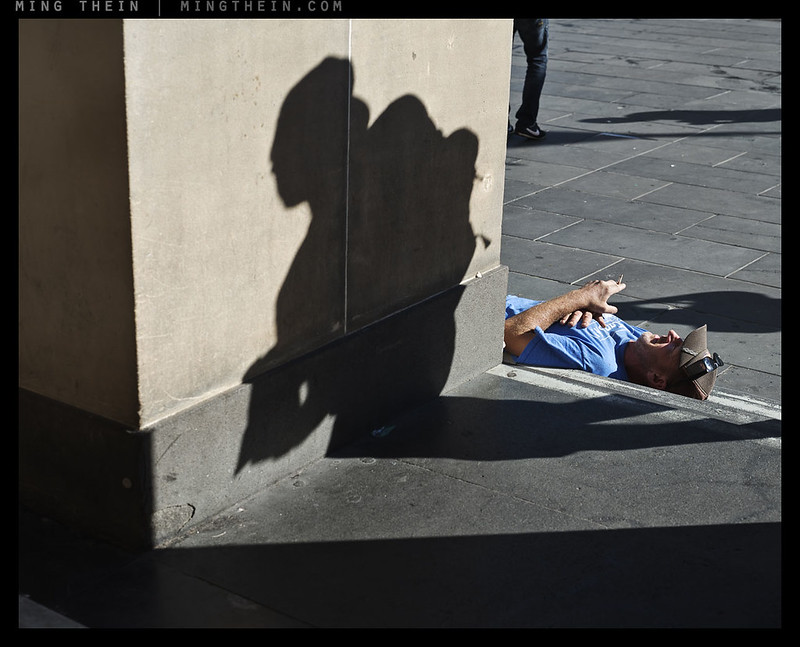
Relaxing smoke
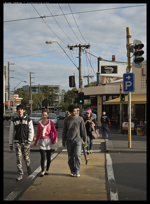
Untitled crossing
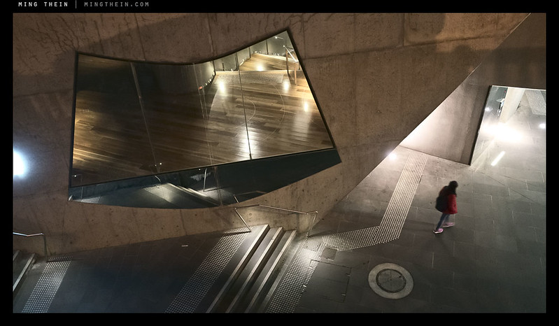
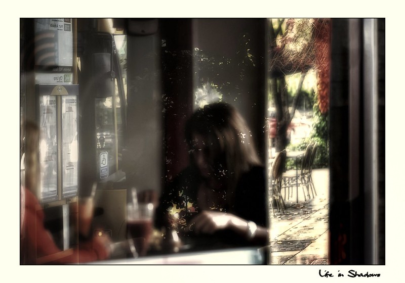
The wedge
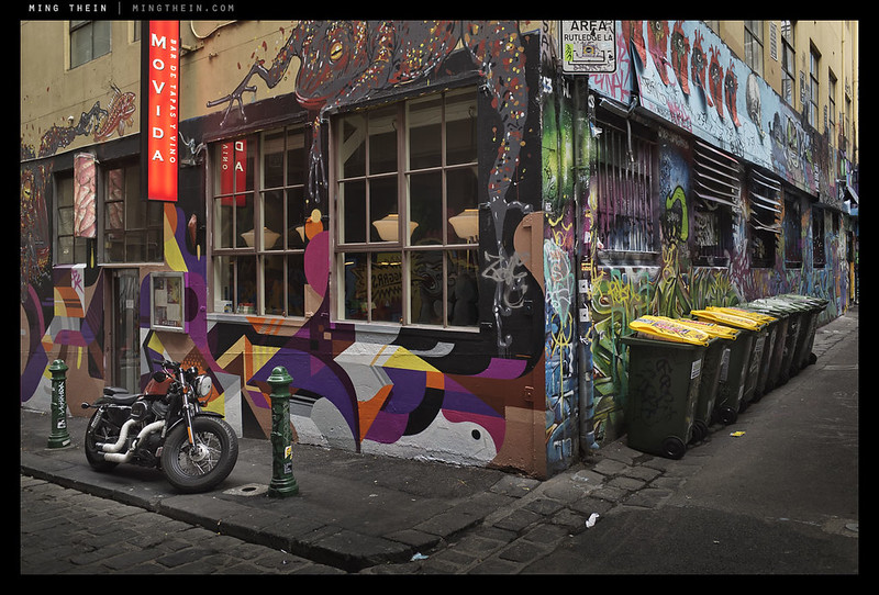
It could still be 1957
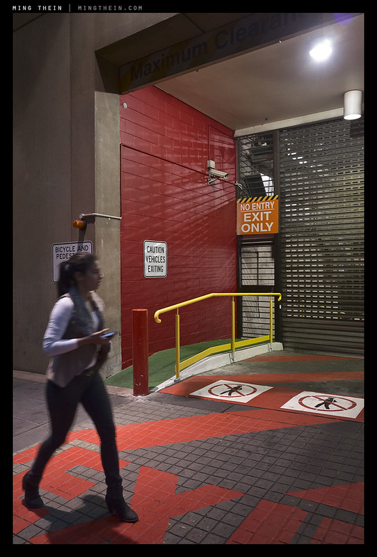
Warning signs
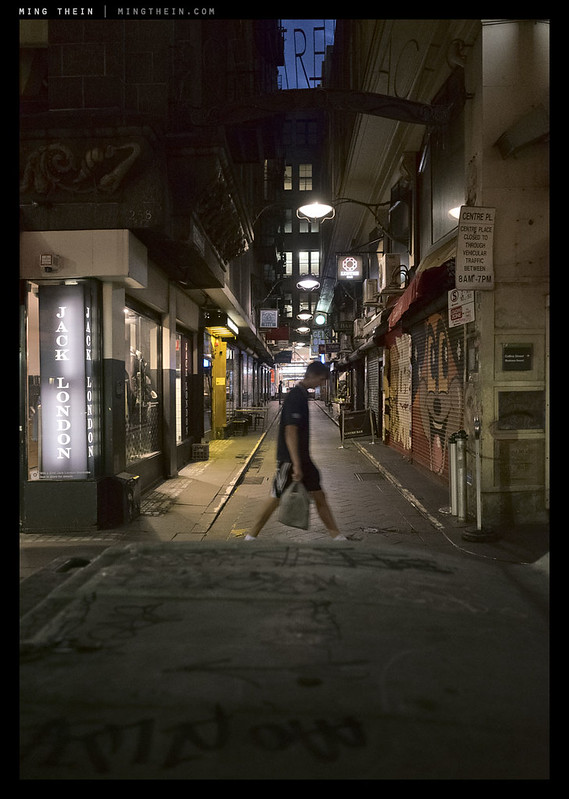
Merely passing through
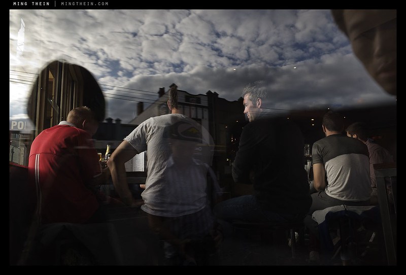
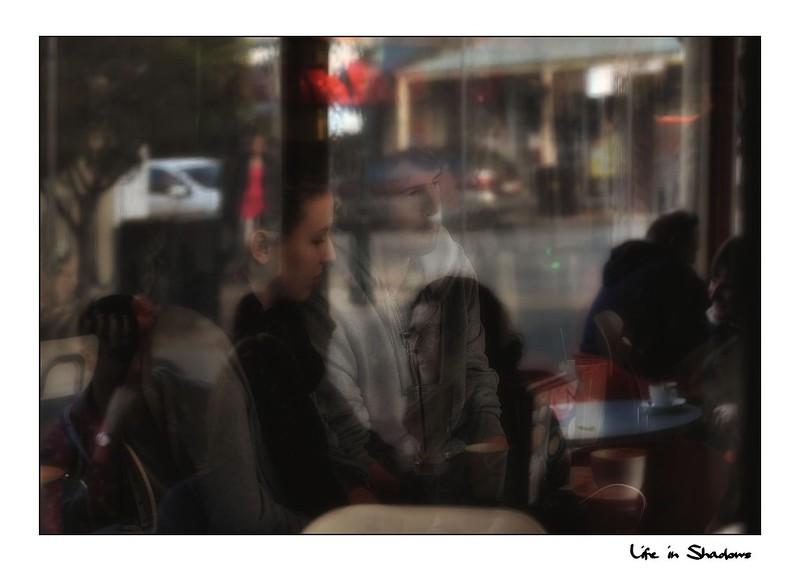
Two worlds meet

Enthusiasm
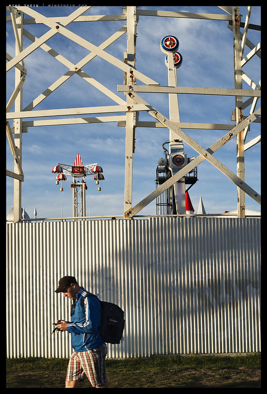
After the fair
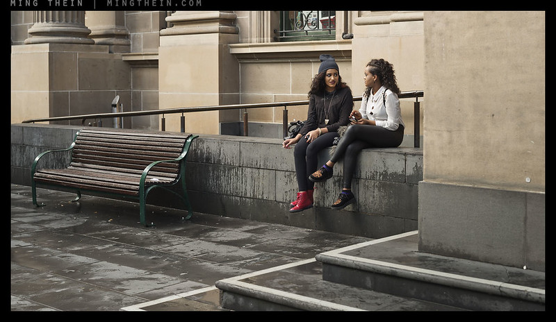
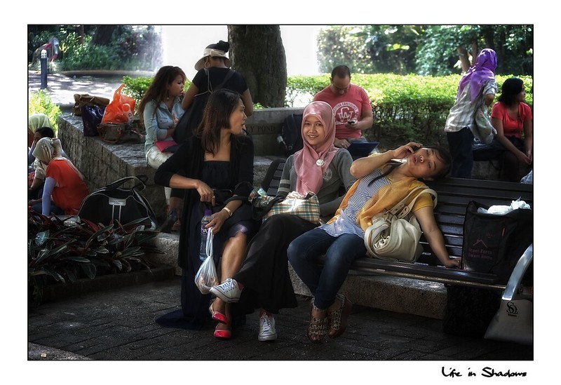
‘You won’t believe what he did next’
__________________
H2 2014 workshops now open for booking – Making Outstanding Images San Francisco, Chicago and Venice; Masterclass San Francisco and Venice – click here to book or for more info
____________
Visit the Teaching Store to up your photographic game – including workshop and Photoshop Workflow videos and the customized Email School of Photography; or go mobile with the Photography Compendium for iPad. You can also get your gear from B&H and Amazon. Prices are the same as normal, however a small portion of your purchase value is referred back to me. Thanks!
Don’t forget to like us on Facebook and join the reader Flickr group!

Images and content copyright Ming Thein | mingthein.com 2012 onwards. All rights reserved


Further to my earlier confirmation that Saul Leiter used expired film, this article mentions it, with part of it reading ” At the press conference in Paris, Leiter confided that he often purchased inexpensive color film that was past its expiration date: he loved to be surprised by the odd shifts in color that would result.”
Here is the link………. https://www.lensculture.com/articles/saul-leiter-saul-leiter-1950-60s-color-and-black-and-white
It is also referred to here…..
http://fadedandblurred.com/spotlight/saul-leiter/
Is this just a net meme? No I do not think so……the first article is too specific in attributing it to Leiter himself.
Thanks – that was the article.
Ming, I love the work of Saul Leiter and have been somewhat influenced by it myself. I aspire to be like him. I have often noted on this site also that your work often has the kind of tonality and color of Leiter and which I pursue. I admire it and it keeps me coming back – so well done. I have recently left full time work and intend focusing (pun intended) on this thing called photography more from here on in. Hopefully I will manage to get more like these.
A half dozen or so links to some of my examples in this vein………..


more here…………
PS If its not obvious I adore reflections and the special “something” that they add to photos. Just like Leiter did. To me he was even more of a master than other better known masters such as HCB because of his mastery of composition, color, tone and reflections. I am still learning and expect to be for a long time yet but the occasional good shot comes along.
Some of my own from Melbourne (a lovely “European” city in the heartland of Australia.)
Thanks – I suspect part of the way his images look is due to his use of expired film; I’ve just managed to get copies of Early Color and Early Black and White, which might perhaps yield a few more clues. Now to find the time to open them…
Expired film? I doubt it. That’s a 21st century concept.
Color film rendition what it was, plus perhaps some fading if the book is generated off uncorrected scans of the old negatives… You never know these days what a publisher does… But surely Mr Leiter had a nice nearby stockist of fresh Rochester produce, right off the farm upstate… In the good old days, one did not buy expired film, nor purposedly let it rot… Still if I were to fish my 70’s slides from some attic in my parents’ house, I’d probably find leiteresque colors (certainly not leiteresque compositions, alas!)
Ming is absolutely correct, I am afraid. Saul Leiter is on the record as having said he used old expired film. Possibly due to economic reasons I suspect.
Thanks – glad I wasn’t going crazy!
I stand corrected! thanks for spotting this.
You may be right, but if anything chemistry was even more susceptible to oxidation back then. I distinctly remember reading an interview with him where he mentioned using out of date film to save money – moving to color was a big deal for both cost and ‘visual responsibility’ (that part is in the intro to Early Color).
and yes, open those books, reverently and not in a hurry.
you’ll be blown away by the vision he brought to his images….
I spent an afternoon with half of the color one. It’s fantastic – and really shows off how his eye as a painter…
glad you like them. you are right they are painterly….
There is something extremely satisfying about watching how carefully composed your images are. Especially the second image here has got everything just “right” in the way the scene is represented.
Thank you.
I really like most of these, which is interesting given that I didn’t generally get the same feeing from the Melbourne black and whites.
A question: I was looking at these pictures with a view to analysing them based on what I’ve picked up from your videos (light, lines, frames, etc). I can see a rationale for all of them bar one: the picture called “untitled crossing”. I’m not seeing what prompted that picture – as Jay Maisel would phrase it, I don’t see the “trigger” which compelled you to shoot it. Any chance you could shed some light (pun intended) on that particular shot?
Thanks. I guess it’s all subjective, or perhaps Melbourne really needs color to pop? As for untitled crossing – it’s a quality of light thing, and I admit it doesn’t work anywhere near as well at web sizes because the subtle separation between foreground and background is mostly not visible.
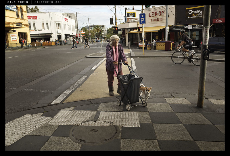
These street shots wouldn’t pass a final edit. I did like the older woman and her dog but a little closer would have been better.
That depends on your objective. I don’t agree with the stick-your-wide-angle-in-random-strangers’-faces ethos.
A little bit closer is not sticking a wide angle lens in someone’s face but thanks for responding. I didn’t have a malicious intent. I enjoy coming to your site. When everyone is praising your images I think it might be a hindrance to you at times.
Hey Ming! I notice you always have sharp focus in your images with the 55mm focal length. I shoot 50mm most of the time and find it hard to nail the focus using a matte screen in the viewfinder at f2. I’ve noticed many of your shots are at f2.8, 4, 5.6 and I’m wondering how you focus. Do you zone focus and then calibrate by eye in the viewfinder, or do you do any live-view magnified focusing? Also, do you stop down because it much harder to focus by eye handheld at 1.4 or because you want a boost in sharpness? Thanks!
I have a custom focusing screen and precisely aligned mirror. Almost no DSLR these days has either because most people use AF. I stop down because I want more DOF…1.4 is used when needed, too.
great thanks! what kind of screen do you use?
An Apple Thunderbolt Display.
Oh sorry, I meant focusing screen in your D800. Also, that’s a nice monitor :p
“I think I needed stronger human subjects to make the compositions work.” That’s something I’m really considering about my own work. I’ve been coming to the conclusion that a human presence or a strong trace of it is vital in the creation of strong narratives for urban photography (whether street or urban landscape).
Actually, I should have been clearer: I meant more character, but at the same time retaining that anonymity and lack of individuality I’m looking for so the images could apply to any type of man. A tough ask, I know…
Ming: As a Saul Leiter fan myself, make sure to grab a copy of the recently released Saul Leiter Early Black And White published by Steidel, shows his eye for the “Leiter framing” and content is his painterly vision. Be well and good work as always…. Daniel http://lens.blogs.nytimes.com/2014/07/08/saul-leiters-black-and-white-photo-world/?_php=true&_type=blogs&smid=fb-share&_r=0
http://www.steidl.de/flycms/en/Books/0223414951.html
Thanks – I’ve got a copy of that on order, eagerly awaiting it…
I got those Leiter B&W books (it’s a two-book set), and his B&W work is a bit different than his color work, just to set expectations. I think his work is a bit diminished without color, since the way he treated color was so unique to him.
Speaking of other photographers, I’m wondering if you’ve looked at Dan Winters’s work? I just got his Last Launch book, which is his book on the very last space shuttle launch. Some of the launch pictures are just stunning — I think it’s very much in the same kind of vein as your TBM series.
Here’s a link to a Time magazine feature of those pictures: http://lightbox.time.com/2012/08/13/last-launch-dan-winters-and-the-shuttle-program/#1 His website has a lot more of his other work too. He still works in film (C-41!), but in large format and with very high technical standards, ie. not a Hipstagramist. The space shuttle stuff was all in digital due to the nature of the work.
Different, yes, diminished, I don’t know. It’s different enough, and his color was so shockingly unique, that yes, at first go you deel: that’s all? Then you start looking at his BW composition, les abstract, less 90mm, more 35mm, it’s another planet yes but it’s equally strong. His portraits are amazingly fresh and personal. His street shots continue to carve reality into discrete unexpected sections, but the absence of color makes the need for composition even stronger and the success even more remarkable…. Get that bookset, it’s worth every euro…
Yes, I was expecting as much. I really want to find the Rene Burri book, too. Thanks for the tip on Winters – will check him out.
With the exception of four that I didn’t too care for, an absolutely wonderful set.
And please don’t mention Saul Leiter again, otherwise you’ll have me salivating! :o)
He just so happens to be one of my photography heroes, and in my opinion one of the best photographers of the 20th century. And I am overjoyed that you like his work too.
Haha, thanks. I’ve got a couple of his books on order, which should hopefully have arrived by the time I get back to KL…
respectfully, but there is nothing in the images above that has any place near Saul’s work. I don’t mean to disparage the set, but guys, get real, look at the books and compare. There is nothing Leiteresque in the OR-aseptic perfection of Ming’s style. Too busy, too sharp, too everything. Leiter’s images are flashes of minimalist composition and color (or no color, the BW twin books show a totallyndifferent but equally powerful approach, I have them and they are to be slowly savored page by page over and over again). Ming’s work is clearly and heavily influences by the professional approach he has (hats off) to product shots (the cars series, the Speedmaster masterpieces). Abstract architecture, ok. Street and people, sorry, look elsewhere. Leiter, leave him to RIP alone.
Not to put words in Ming’s mouth, but I don’t think that at any point has he compared himself to Saul Leiter; he has described himself as “heavily influenced by” him. I’m “heavily influenced” by Jay Maisel, but that’s not the same as my photography being “any place near his work” (believe me, it isn’t).
Aren’t you considering this in a rather binary fashion (“Ming’s work is generally based on precision and set-up scenes, ergo he can’t do spontaneous or artistic stuff”)? It’s not an either/or thing.
Influence isn’t the same as copy. And I wouldn’t want to copy anyway – precision is my thing even if it is spontaneous and isn’t set up. 🙂
No, and it wasn’t meant to be a copy. Influence isn’t the same thing…
Ming, far from me to say that you are copying a style. you are not, you are a pro in your field. All I’m saying is that if you asked me who is most influencing your style, Leiter is not what comes to mind first. You are in the f/64 school frame of reference, at the opposite end of the spectrum. Nothing wrong with that.
Anyways, changing subjects and moving to book suggestions, try Bernard Plossu’s Séquences Photographiques, amazing color work as well, very interesting printing technique too. you can find it at http://www.abebooks.com/servlet/BookDetailsPL?bi=11845452667&searchurl=bsi%3D0%26amp%3Bds%3D30%26amp%3Bisbn%3D9782754107211
Best,
G
OK, now I understand: the amount of controlled studio work I do starts me off from the f/64 end, but I find that too rigid and formal; I’m consciously trying to bring elements of Leiter into it, but there are obviously restrictions…
Glad I made myself clear. My first post could have been read as too blunt. Well, wish you well in your quest for Saul. Which rhymes with soul! I guess the trick is, let go! Most of all, let go of sharpness, deliberately shoot slower and accept a bit of imperfect focus for a while. Some of my own best( = I like most) images were technically imperfect, but out of imperfection comes soul. After all, quoting masters, Capa’s. d-day shot is a total disaster, and yet speaks about that moment as nothing else ever could… Which doesn’t mean sloppiness is a virtue, of course.
Get that Plossu, you’ll be amazed. Not a single sharp image in sight, and yet!
Not that – I think it was clear in my mind that the images were no way meant to be a facsimile of Saul, but rather there were influences in certain uses of layering and colour which I was trying to integrate with more of my normal formalist ways.
I’m still not convinced that technical imperfection is soul though, I’d like to believe that one can have both…
Weren’t Capa’s images the result of the person in the lab messing up and some last minute rescue work by the editor?
Yes they were, actually two other rolls were destroyed. Still the mishap makes for even more compelling images!
To each their own, i guess.
I find for example Ansel Adams’s images incredible and beautiful in a formal way, but I struggle to be moved by them. Most of the prints I have bought for my personal collection are less than crisp, but they just talk to me a lot more because of that. The ‘moment’ is in flux, our perception of the world is less than precise, and a too precise representation of that world is therefore less realistic than it should be…
Again I’m not suggesting sloppiness, not at all, that’s poor work and unprofessionalism. But simply that each type of photography belongs to a different technique. Your Speedmaster glowing in the dark is fantastic, but it’s a Speedmaster (my favorite watch ever, mind you), not a living thing.
I will finish by quoting Mario Bottura the celebrated top chef in Modena, who the other day was talking about the incredible richness of Sicilian cuisine and said (I’m not quoting verbatim!): Sicily is the most imperfect of Italian regions, but it’s precisely that imperfection that makes it perfect in its richness of unique flavors, rooted in the soul of the land and the sea. The most flavorful tomatoes ripen on a vine and are all squiggly/ugly…
🙂
G
Makes sense. And I’m a big fan of those squiggly Sicilian tomatoes…
i was looking at these images on my RSS feed and thinking – that’s Melbourne (my old home town) – even though there was nothing that actually that could really pin-point in the images. you’ve really captured the city in an interesting way. thanks.
Thanks – out of curiosity, any idea what it is specifically that you think says ‘Melbourne’?
Very tricky exposures. ETTR-like but even not that.always. A diverse set of images. Brave highlights.
Actually, it’s not so much ETTR as expose for the subject and let the rest fall where it may – just being careful that the transition to overexposure is smooth and doesn’t distract the eyes…
Very nice series. well done on your work. Like the Graf one: Two worlds meet.
Thanks!
Impressive set of images! Very nice!
Thanks Eric!
Masterful use of black in these lovely images of places I know better than the back of my hands. Cheers, KL
Thank you. Did any of it look or feel familiar?
Nice job!
Thanks!
I love these images. Just great (as usual). “You won’t believe what he did next” – I am still laughing. Not only a nice composition, but you’ve captured the facial expressions of both girls perfectly.
Thanks!
These are just stunning Ming! Loved the colours and compositions in each of these shots…very naturally captured!
Thanks!